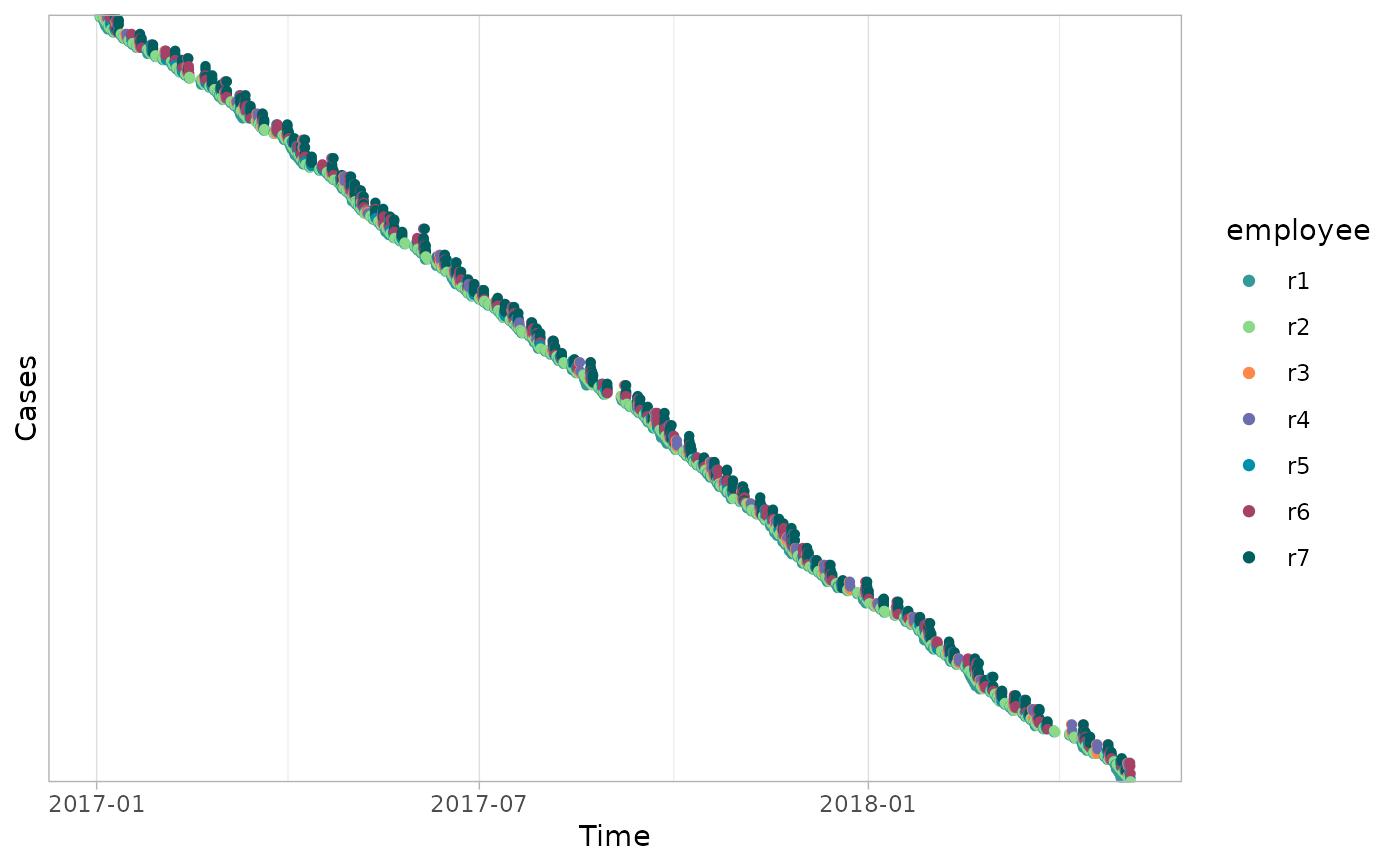
A dotted chart is a graph in which each activity instance is displayed with a point (dot). The x-axis refers to the time aspect, while the y-axis refers to cases.
Usage
dotted_chart(
  log,
  x = c("absolute", "relative", "relative_week", "relative_day"),
  sort = c("auto", "start", "end", "duration", "start_week", "start_day"),
  color = NULL,
  units = c("auto", "secs", "mins", "hours", "days", "weeks"),
  add_end_events = FALSE,
  scale_color = bupaR::scale_color_discrete_bupaR,
  plotly = FALSE,
  eventlog = deprecated()
)

# S3 method for class 'eventlog'
dotted_chart(
  log,
  x = c("absolute", "relative", "relative_week", "relative_day"),
  sort = c("auto", "start", "end", "duration", "start_week", "start_day"),
  color = NULL,
  units = c("auto", "secs", "mins", "hours", "days", "weeks"),
  add_end_events = FALSE,
  scale_color = bupaR::scale_color_discrete_bupaR,
  plotly = FALSE,
  eventlog = deprecated()
)

# S3 method for class 'activitylog'
dotted_chart(
  log,
  x = c("absolute", "relative", "relative_week", "relative_day"),
  sort = c("auto", "start", "end", "duration", "start_week", "start_day"),
  color = NULL,
  units = c("auto", "secs", "mins", "hours", "days", "weeks"),
  add_end_events = FALSE,
  scale_color = bupaR::scale_color_discrete_bupaR,
  plotly = FALSE,
  eventlog = deprecated()
)

# S3 method for class 'grouped_eventlog'
dotted_chart(
  log,
  x = c("absolute", "relative", "relative_week", "relative_day"),
  sort = c("auto", "start", "end", "duration", "start_week", "start_day"),
  color = NULL,
  units = c("auto", "secs", "mins", "hours", "days", "weeks"),
  add_end_events = FALSE,
  scale_color = bupaR::scale_color_discrete_bupaR,
  plotly = FALSE,
  eventlog = deprecated()
)

# S3 method for class 'grouped_activitylog'
dotted_chart(
  log,
  x = c("absolute", "relative", "relative_week", "relative_day"),
  sort = c("auto", "start", "end", "duration", "start_week", "start_day"),
  color = NULL,
  units = c("auto", "secs", "mins", "hours", "days", "weeks"),
  add_end_events = FALSE,
  scale_color = bupaR::scale_color_discrete_bupaR,
  plotly = FALSE,
  eventlog = deprecated()
)
Arguments
- log
log: Object of classlogor derivatives (grouped_log,eventlog,activitylog, etc.).- x
character(default"absolute"): Value to plot on x-axis:"absolute"time or"relative"time (since start of week:"relative_week", since start of day:"relative_day").- sort
character(default"auto"): Ordering of the cases on y-axis:"auto"(default, see Details),"start","end","duration","start_week", or"start_day".- color
character(defaultNULL): Attribute to use for coloring the activity instances (dots). This attribute should be present inlog. Default (NULL) is the activity identifier (activity_id()). UseNAfor no colors.- units
character(default"auto"): Time units to use on the x-axis in case of relative time:"auto"(default, see Details),"secs","mins","hours","days", or"weeks".- add_end_events
logical(defaultFALSE): Whether to add dots for the complete lifecycle event with a different shape.- scale_color
ggplot2scale function (defaultscale_color_discrete_bupaR): Set color scale. Defaults toscale_color_discrete_bupaR. Replaced withscale_color_discretewhen more than 26 activities are present.- plotly
logical(defaultFALSE): Return aplotlyobject, instead of aggplot2.- eventlog
![[Deprecated]](figures/lifecycle-deprecated.svg) ; please use
; please use loginstead.
Details
When setting sort to "auto", the ordering of cases is done automatically, based on the specified value of x:
x = "absolute":sort = "start",x = "relative":sort = "duration",x = "relative_week":sort = "start_week",x = "relative_day":sort = "start_day".
When setting units to "auto", the time units on the x-axis is done automatically, based on the specified value of x:
x = "absolute":units = "weeks",x = "relative":units = "weeks",x = "relative_week":units = "secs",x = "relative_day":units = "secs".
Methods (by class)
dotted_chart(eventlog): Create dotted chart for aneventlog.dotted_chart(activitylog): Create dotted chart for anactivitylog.dotted_chart(grouped_eventlog): Create dotted chart for agrouped_eventlog.dotted_chart(grouped_activitylog): Create dotted chart for agrouped_activitylog.
Examples
library(processmapR)
library(eventdataR)

patients %>%
 dotted_chart(x = "absolute", sort = "start", color = "employee")