bupaR Docs | Dotted Charts
![]()
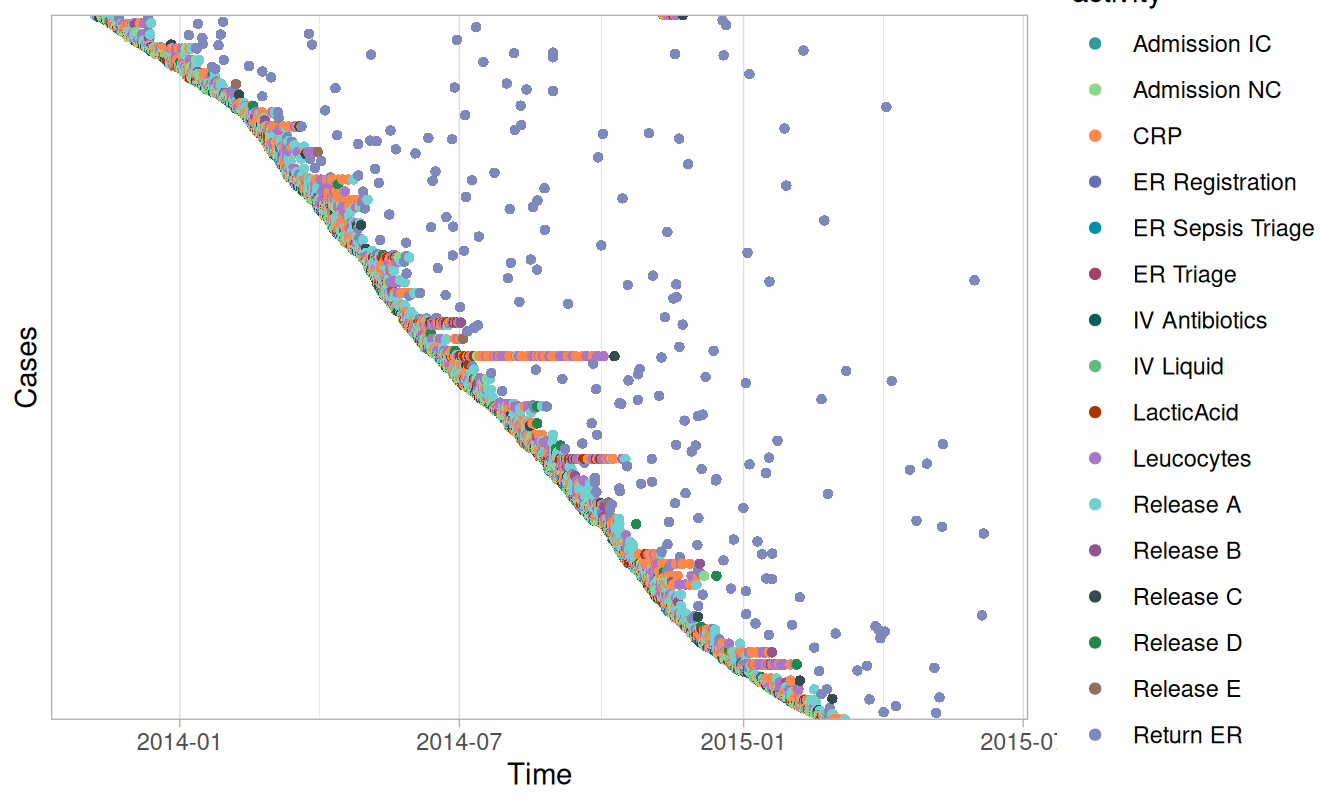
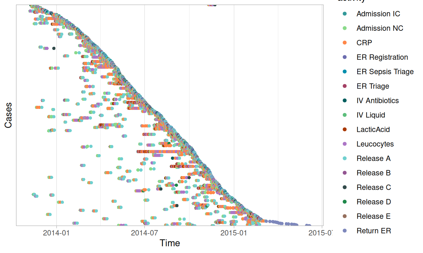
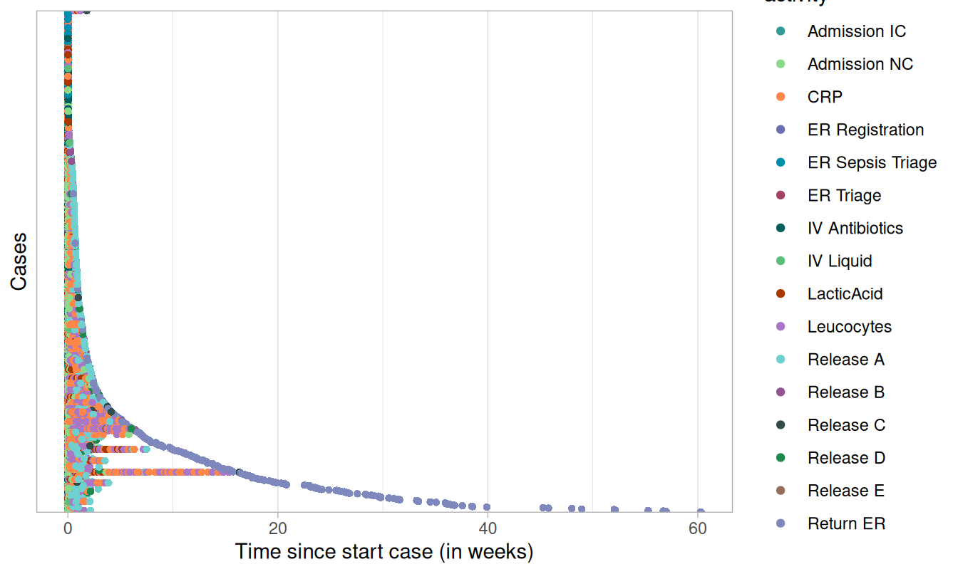
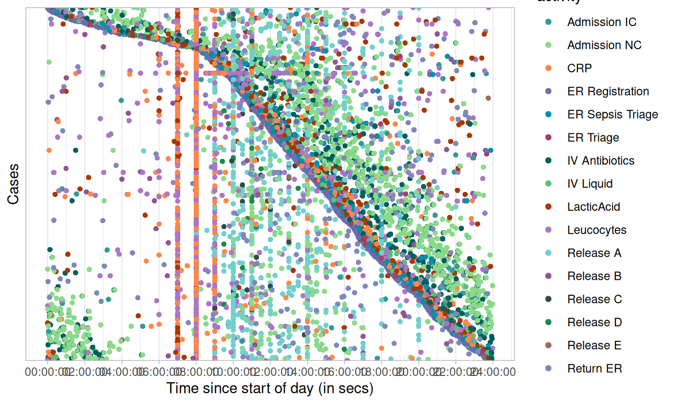
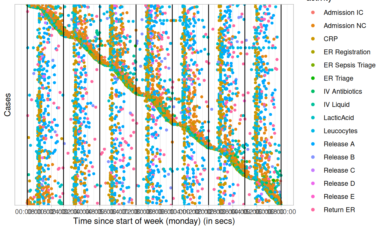
Dotted chart
Dotted charts can be made with dotted_chart(). A dotted
chart is a graph in which each activity instance is displayed by a dot.
The x-axis refers to the time aspect, while the y-axis refers to cases.
The dotted chart function has 3 arguments:
- x:
- absolute: absolute time on x-axis
- relative: time difference since start case on x-axis
- relative_day: time difference since start of day on x-axis (00:00)
- relative_week: time difference since start of week on x-axis (Mondag 00:00)
- sort: The ordering of the cases along the y-axis:
start, end, duration, start_day, or
start_week. Value auto (default) will set sort
appropriately given the argument for
x - color: The attribute used to color the activity instances. Defaults to the activity type.
Below, you can see some examples for dotted charts with various configurations.
Absolute
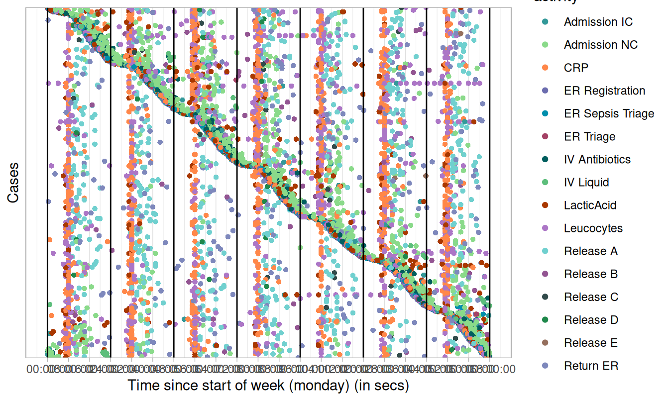
Other configurations:
- change the used color scale by configuring the
scale_colorargument.
Read more:
Copyright © 2025 bupaR - Hasselt University